CSS
CSS is a markup language for describing the visuals of web pages. It contains numerous properties for changing how the HTML elements look like (color, font, position and so on).
Prettier defaults
Let’s use the Pure CSS library to make the fonts, buttons and other things to look nicer than what the web browser gives you by default.
Add the following code inside your HTML page’s <head> element.
<link rel="stylesheet" href="http://yui.yahooapis.com/pure/0.6.0/pure-min.css">
Note: The <meta charset="UTF-8"> element must be in the beginning of <head>, but otherwise the order of elements inside <head> doesn’t usually matter.
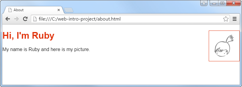
Custom styles
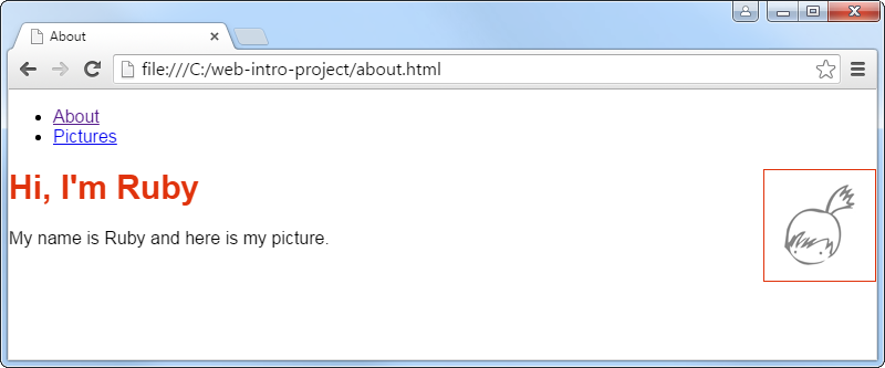
We could set the visual style for each HTML element individually, but that quickly becomes a lot of work. Instead, in a CSS file we can in one place change the visual style of all elements on the web site. For example we can say that all headings should be red. If we want only some elements to look different, we can give them a name with CSS classes and give them a different visual style. For example there are many pictures on the web site, but the profile picture has a colored border.
To have a place where to add our own CSS, create a file style.css with the following content.
h1 {
    font-size: 30px;
    color: #E0330C;
}

.profile-picture {
    float: right;
    border: 1px solid #E0330C;
}
Add into your <head> a stylesheet link which points to that CSS file.
<link rel="stylesheet" href="style.css">
This CSS defines the visual style for the h1 element and profile-picture class. The . in front of .profile-picture means that any element with the class="profile-picture" attribute will have this style.
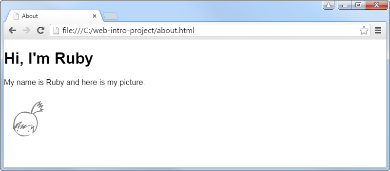
Add the class="profile-picture" attribute to your <img> tag. Then because of the float: right; CSS property, the picture will will position it to the right of elements that follow it. To make the picture be on the right side of your page’s heading, you will need to move the picture’s element before the heading’s element.
Layout
A good starting point for making a web site is to draw on paper a sketch of what you want the site to look like. Here is a sketch of a typical layout where the navigation menu is on the left and page content in the middle.
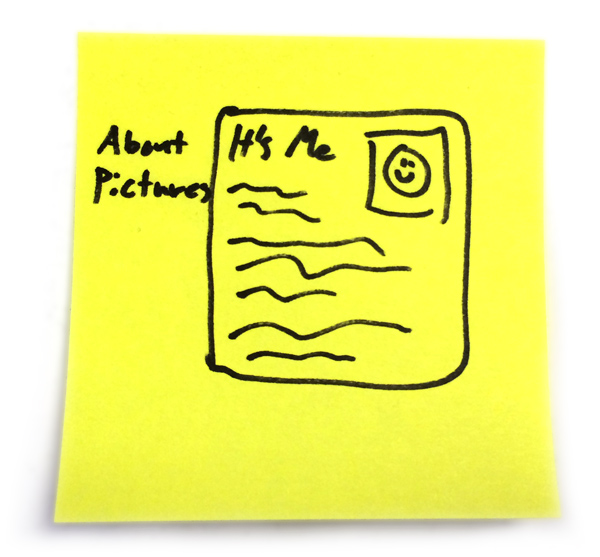
Then we can start converting that into code. We’ll start with the structure, then the positioning of the navigation and content, and finally make it all pretty.
Page structure
Add the following elements to your page’s <body> and put the page content you wrote earlier inside the content section.
<nav class="navigation">
    <ul>
        <li><a href="about.html">About</a></li>
        <li><a href="pictures.html">Pictures</a></li>
    </ul>
</nav>

<section class="content">
    page content goes here
</section>
This navigation menu is made out of an unordered list (<ul>) which contains list items (<li>) which contains links (<a> as in anchor) to the site’s pages (we’ll create the pictures page later).
The <nav> and <section> elements are just “boxes” for more content. They are similar to the <div> element (if you happen to know some HTML), but have some semantic meaning, so for example the screen readers for blind people can be smarter about where the navigation is etc.
Prepare for layout fiddling
To get the page layout right, it’s easier to focus on one thing at a time. We’ll first focus on just positioning the navigation and page content. Afterwards we can make them pretty.
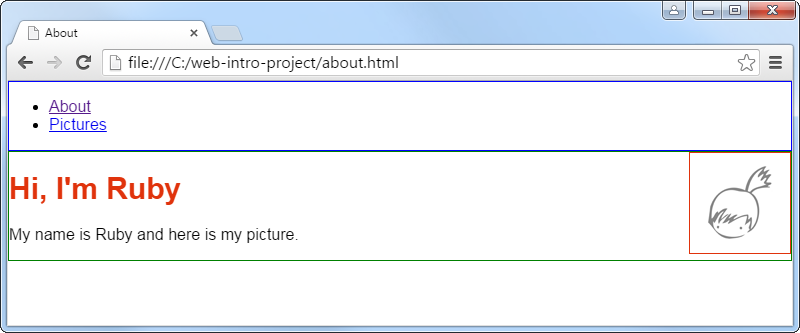
To get ready for fiddling with the positioning of layout elements, make the edges of .navigation and .content visible by adding the following CSS code to your style.css file.
.content {
    border: 1px solid Green;
}

.navigation {
    border: 1px solid Blue;
}
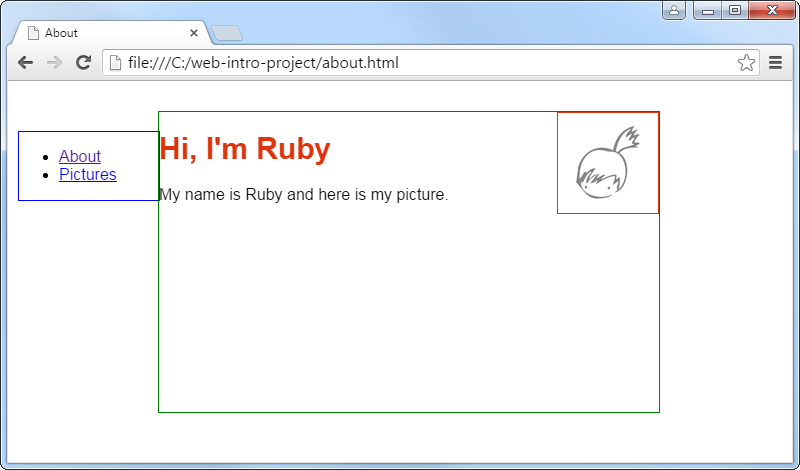
Position the layout elements
First add the position: absolute; CSS property to the style definitions of .content and .navigation. Absolute position means that the position of the element is relative to the browser window, instead of other HTML elements (which is the default). Don’t worry about understanding this yet.
Then start experimenting with different values for the CSS properties left, top and width to get the boxes to look like shown below. Instead of width you can also use right to make it stretch based on the browser window size.
It’s a good practice to try out how the layout stretches when the page has many or few paragraphs of text, or when the browser window is wide or narrow. You can use min-height to enforce a minimum height for an element when it has only a little content.
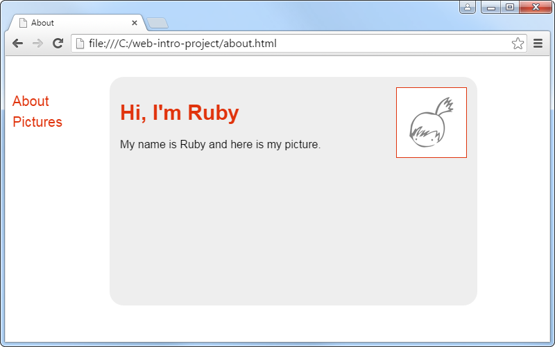
Make it pretty
After the boxes are where you want them to be, remove those placeholder borders and move on to styling the visual look of the layout elements. You can for example change their background, border, padding and margin (padding is empty space inside the borders, margin is empty space around the borders).
For the navigation menu, just copy the following CSS as a starting point. If you like, you can google “css vertical navigation bar” for more examples. This kind of CSS tricks are hard to make yourself; everybody just copies them from someone else. ;-)
.navigation ul {
    list-style: none;
    padding: 0;
    margin: 0;
}

.navigation li {
    font-size: 20px;
    line-height: 30px;
}

.navigation a {
    text-decoration: none;
    color: #E0330C;
}

.navigation a:hover {
    color: #F09986;
}
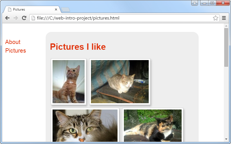
Pictures page
Last time we created a navigation menu with a link to the pictures.html page, but that page doesn’t yet exist. Let’s create it now.
Make a copy of about.html, name it pictures.html, and change its title and heading. Find about a dozen images which you like from Public Domain Pictures and add their thumbnails as images on your pictures.html using the <img> tag.
<img class="album-photo" src="http://www.publicdomainpictures.net/pictures/50000/t2/cat-looking-up.jpg">
<img class="album-photo" src="http://www.publicdomainpictures.net/pictures/30000/t2/cat-in-the-city-5.jpg">
<img class="album-photo" src="http://www.publicdomainpictures.net/pictures/30000/t2/annoyed-cat.jpg">
...
As shown above, give the images a unique class and use CSS to make them look like a photo album. In case the pictures are of different size, you can set their height; the web browser will set their width automatically to maintain the picture’s aspect ratio.
The following example uses the CSS properties border, background-color, margin, padding and box-shadow.